This is one thing I actually think America does right. I'm the type of person to eat a single tic-tac, but even if I acknowledge that there are failures, it's far easier for me to get a rough sense as to how bad eating something is if it lists it's actual content. Ideally there would be both, but having to do 0.85 * 260 just to get the calorie count for this is just annoying.
I do think the design of the labels is completely ridiculous, though. Sugar, trans fats, and caloric count should be made much more prominent and put in red so that uninformed people understand that these are the primary causes of sickness in America.
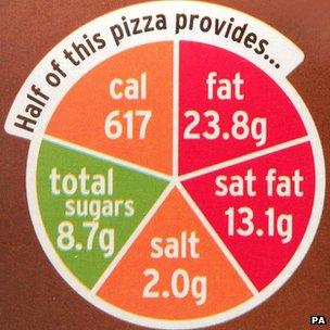
That's more-or-less what Sainsbury's (in the UK) did with their products.
Most things must show the amount per serving and the amount per 100g (in common across the EU), but they also show a chart with green/orange/red based on a typical serving size.
I do think the design of the labels is completely ridiculous, though. Sugar, trans fats, and caloric count should be made much more prominent and put in red so that uninformed people understand that these are the primary causes of sickness in America.